1Australian Nation University, 2IBM Research, 3Columbia University
ACM Multimedia 2011, Scottsdale, AZ, Nov 2011 [pdf][slides]
^an short version appeared in ICWSM 2011; ^^an extension of this work appeared in ACM MM 2010
A re-implementation of the meme-detection algorithm, by David Hehir, is here.
Here are some example observations:
- Over 50% news-related videos contain remixed content, over 70% YouTube authors participate in remixing.
- Remix probability does not correlate well with traiditional popularity metrics such as view count.
- Influence analysis on visual remix overtime can reveal content importance and user roles.
Our main approaches include: Topic-based monitoring of news content on YouTube, robust visual matching at scale, graph-based influence analysis to observe content importance and user roles.
| YouTube has become a virtual worldwide bazaar for video content of almost every type. With 72 hours of video being added every minute, it is a living marketplace of ideas and a vibrant recorder of current events. We use text queries to pre-filter content, and make the scale of monitoring feasible. This is done via a number of generic, time-insensitive text queries sent to YouTube API. We use the term buzz to refer to all the videos that respond to keyword queries YouTube, although their content may not be directly related to the current event. We use the term meme videos to refer to containing one or more memes. Although being a noisy representation of The volume of retrieved and memes are telling indicators of event evolution in the real world, as seen in example traces on the right. |

|
|
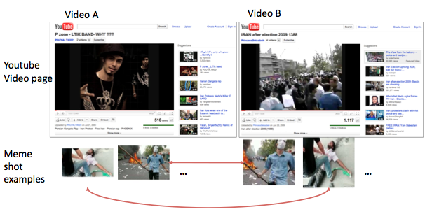
Visual memes are defined as frequently reposted video segments or images. It has been observed that users tend to . News event collections are particularly suited for studying large-scale user curation, since remixing is more prevalent here than on video genres designed for self-expression, such as video blogs. The unit of interaction appears to be video segments, consisting of one or a few contiguous shots. The Figure on the right shows two example YouTube videos that share multiple different memes. Note that it is impossible to tell from metadata or the YouTube video page that they shared content, and that the appearance of the remixed shots (bottom row) has large variations. |

|
|
We query YouTube using a set of topic-related keywords to retrieve large amounts of video entries over a few months. Our tracking algorithm for large-scale video shot matching include two main parts: robust visual matching using color-correlogram, and scalable indexing using approximate nearest neighbors. A high-level flow chart of the algorithm components is found to the right. |

|
| Meme clusters from the SwineFlu collection, we can see examples of pig-related song or mock clips (S1 and S3), educational clip (S4). | |||
 (S1)
(S1)
|
 (S2)
(S2)
|
 (S3)
(S3)
|
 (S4)
(S4)
|
|
Meme clusters from the Iran2009 collection include potraits of prominent individual, groups during the event, as well as memorable scenes. The total number of visual memes in this collection is over 10,000, only a small sample is shown here. |
|||
 (I1)
(I1)
|
 (I2)
(I2)
|
 (I3)
(I3)
|
 (I4)
(I4)
|

In the Iran2009 topic (blue dots) we can see two distinct types of contributors.
The SwineFlu collection seems different. We can see a number of connectors on the upper right hand side of the total diffusion scatter. But it turns out that they are the traditional media (a few marked in gray), most of which have a large number (>40) of videos with memes. The few mavens in this topic (marked with green text) are less active than in the Iran topic, and notably they all reposted the identical old video containing government health propaganda for the previous outbreak of swine flu in 1976. These observations suggest that it is the traditional new media who seem to have driven most con- tent on this topic, and, while serendipitous discovery of novel content sill exists, it has less diversity.
Such visualizations can serve as a tool to observe information dissemination patterns in various events, and henceforth characterize influential users. Such tools can identify the key influencers for each event, including both mavens, or early "information specialists", and connectors, who "bring the rest ... together" (Gladwell 2000).- List of visual meme tuples for the 2009 Iran Election collection.
(zipped csv)
This set contains 199.6K video shots containing 39.7K different memes in 13.2K distinct videos.
- This is release v0, more coming soon ... feel free send me an email if there's something else specific you'd like to use.
- J. Burgess and J. Green, YouTube: Online video and participatory culture, Polity, 2009
- P. Snickars and P. Vonderau. The YouTube Reader. National Library of Sweden, 2010.
- J. Leskovec, L. Backstrom, J. Kleinberg, Meme-tracking and the Dynamics of the News Cycle, ACM SIGKDD International Conference on Knowledge Discovery and Data Mining (KDD), 2009.
- M. Gladwell. The tipping point: How little things can make
a big difference. Little, Brown and Co., 2000.
- for a full list of references please see the paper.